
I think it’s really necessary to make every blogger mobile friendly. You might ask why. So here is a clear statement for you.
Mobile users are increasing dramatically because of so much cheap internet packages from the operators. Actually, the mobile internet cost is half or even lower than a wireless or broadband connection. So a lot of people choose to surf the internet using their mobile phones.
Blogger.com has feature for blogger blogs with which you can give a different view of your blog to the mobile web users. Now you can enable the mobile template for your blog which shows your blog in a more simple way without any big images, animations, and advertisements on mobile devices.
You don’t have to make any changes to your current blogger template, all you need to do is enable the setting on your blogger dashboard if you’re using on your blog responsive theme.As you know, millions of people use their mobile phones to access the internet. The mobile internet speed is also very fast these days.
so we can say many of your readers are coming to your blog through mobile phones…But, if you don’t make your blog mobile-friendly, you may lose all your mobile readers because in a mobile phone, a normal blog takes lot’s of time to load your blog posts and there are other issues that your site not fitting properly on the mobile screen.
if you do not make your blog mobile you may lose your mobile readers …
How To Make Your Blogger Blog Ready For Mobile Phone
To make your blog ready for mobile user follow these step
#Step 1
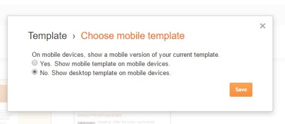
- Visit blogger and then navigate to template
- Click on the Gear icon shown below the mobile template
- And then Choose “No, Show desktop template on mobile devices”
- Now save.
if you are using a resposive blogger theme your blog design now will be mobile-friendly you don’t need to follow the second step
Step 2
- log in you account
- click on the template
- click on the edit HTML
- now find the blow code to find it press CTRL+F
<head>
<b:if cond='data:blog.isMobile'>
<meta content='width=device-width,initial-scale=1.0,minimum-scale=1.0,maximum-scale=1.0' name='viewport'/>
<b:else/>
<meta content='width=1100' name='viewport'/>
Replace the above code with the below code. – This code will help us set the rules and the template what to show on certain devices.
<meta content='width=device-width, initial-scale=1, maximum-scale=1' name='viewport'/>
Save the template. This is just the first few steps and this code above gives information to the web browser about the screen size of the mobile device or tablet.
Adding Mobile Friendly Breakpoints For Blogspot blogs
<style>
/* ########  Responsive Cheat Sheet ########### */
/*-----Mobile Devices ZONE1 ----------*/
@media only screen and (max-width:320px) {
}
/*-----Tablet Devices ZONE2 ----------*/
@media only screen and (max-width:480px) {
}
/*-----Small Laptops ZONE3 ----------*/
@media only screen and (max-width:568px) {
}
</style>
and paste the following CSS Code just below it.
Make BlogSpot Template Fit Mobile Devices.
/*-----For Mobile Devices ZONE1 ----------*/
@media only screen and (max-width:568px){
}.post{height:auto;width:100%!important;display:inline-block;text-decoration:none;float:left;margin:0 1.1% 2%;padding:0!important}.main-inner .column-right-outer{width:100%!important;padding-bottom:50px!important;padding-top:50px}}
}
Make BlogSpot Template Fit Tablet Devices.
/*-----Tablet Devices ZONE2 ----------*/

@media only screen and (max-width:800px){
.main-inner .column-center-inner {padding: 0px;}
.main-inner .columns{padding-left:0;padding-right:310px;width:100%!important;position:relative;right:0!important}
.main-inner .column-right-outer{width:310px!important;margin-right:0!important;position:relative;right:10px!important}
.main-inner .column-right-outer{padding-top:50px!important;padding-bottom 50px!important}}
Make BlogSpot Template Fit Small Laptops
./*-----SmaLL laptops ZONE3 ----------*/
  @media only screen and (max-width:1010px) {
body .navbar {height: 0px !important;}
body{min-width:0!important;width:100%!important;padding:0!important}
.content{width:100%!important;min-width:0!important;overflow:hidden!important}
.header-outer{width:100%}
.fauxborder-left{width:100%!important}
html body .region-inner{min-width:0!important;max-width:100%!important;width:100%!important;padding-left:0}
.header-inner .section{margin:0;width:100%!important}
.footer-outer{width:100%!important}
.content-outer,.content-fauxcolumn-outer,.region-inner{min-width:0!important;max-width:100%!important}
#sidebar-right-1{width:100%!important}
.main-inner .column-right-outer{width:45%!important;margin-right:-310px;position:relative;right:10px!important}
.main-inner .columns{padding-left:0;padding-right:310px;width:70%!important;position:relative;right:20px!important}
#sidebar-right-1 a img{max-width:100%!important}
.post-body img, .post-body .tr-caption-container {
    max-width: 100%;
    height: auto;
}
}
Now save your Blogspot template you have successfully optimized your blog, your blog now ready for mobile phone
if you feel this post is helped you please do share it with your friends on Facebook, Twitter, Google+ and let me know if you face any problem in optimizing your blog

The information you shared through your post is functional. I admire your work. Wish you all the luck for all your blogging efforts.