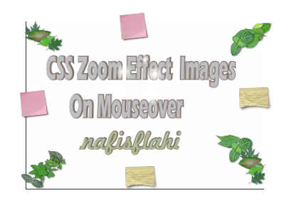
Previously i shared Awesome Expand Social Media Widget today I’m sharing how to add stylish zoom effect to your blog images on mouse over your know you can optimize your blog images for better seo know how to optimize your blog image for better seo if you are running photography blog then these effects are best for your blog to give your blog image attractive look because any visitors who visit your blog and move mouse over the images the image will automatically show different effect after removing mouse the image will come in original position so I’m sharing there few stylish css effect for your blog images on mouse over
How To Add Zoom Effect To Blog Images
- Go Blogger Dashboard
- Click on the Template >> Edit HTML
- Now Find ]]></b:skin> to find it pres CTR+F
- Copy the below code and past it before this ]]></b:skin>
Style 1#
.zoomeout img{
-webkit-transform:scale(0.8);
-moz-transform:scale(0.8);
-o-transform:scale(0.8);
-webkit-transition-duration: 0.5s;
-moz-transition-duration: 0.5s;
-o-transition-duration: 0.5s;
opacity: 0.7;
margin: 0 10px 5px 0;
}.zoomeout img:hover{
-webkit-transform:scale(1.1);
-moz-transform:scale(1.1);
-o-transform:scale(1.1);
opacity: 1;
}
Add This Effect to Your Blog Image
when you upload any image to your post editor section switch your post editor to HTML mode and which one effect you want show on your images simpply change the class in first css class zoomeffect
<a class=”zoomeffect” href=”Your Image URL“><img src=”Your Image URL”></a>
Style 2#
.nfzoom img {
/* Stretching the images to fill whole elements */
width: 35%;
height: 35%;/* Preventing blank space below the image */
line-height: 0;/* A one-second transition was to disturbing for me */
-webkit-transition: all 0.3s ease;
-moz-transition: all 0.3s ease;
-o-transition: all 0.3s ease;
-ms-transition: all 0.3s ease;
transition: all 0.3s ease; }.nfzoom img:hover {
/* Making images appear bigger and transparent on mouseover */
opacity: 0.5;
width: 45%;
height: 45%;
}
<a class=”nfzoom” href=”Your Image URL“><img src=”Your Image URL”></a>
Style3#
.grow img {
height: 300px;
width: 300px;-webkit-transition: all 1s ease;
-moz-transition: all 1s ease;
-o-transition: all 1s ease;
-ms-transition: all 1s ease;
transition: all 1s ease;
}.grow img:hover {
width: 150px;
height: 150px;
}
<a class=”grow” href=”Your Image URL“><img src=”Your Image URL”></a>
Style4#
.zoomin img {
border:15px solid #008E00;
-webkit-transition: all 1s ease;
-moz-transition: all 1s ease;
-o-transition: all 1s ease;
-ms-transition: all 1s ease;
transition: all 1s ease;
}.zoomin img:hover {
border:30px solid #24006B;
border-radius: 250px;
margin: 0;
padding: 0;
margin-bottom:0px;
overflow:hidden;
}
<a class=”zoomin” href=”Your Image URL“><img src=”Your Image URL”></a>
style5#
.extrasize img{
-webkit-transform:scale(0.8); /*Webkit: Scale down image to 0.8x original size*/
-moz-transform:scale(0.8); /*Mozilla scale version*/
-o-transform:scale(0.8); /*Opera scale version*/
-webkit-transition-duration: 0.5s; /*Webkit: Animation duration*/
-moz-transition-duration: 0.5s; /*Mozilla duration version*/
-o-transition-duration: 0.5s; /*Opera duration version*/
}
.extrasize img:hover{
-webkit-transform:scale(1.1); /*Webkit: Scale up image to 1.2x original size*/
-moz-transform:scale(1.1); /*Mozilla scale version*/
-o-transform:scale(1.1); /*Opera scale version*/
opacity: 1;
}
<a class=”extrasize” href=”Your Image URL“><img src=”Your Image URL”></a>
Now simply change the Your Image URLwith image link